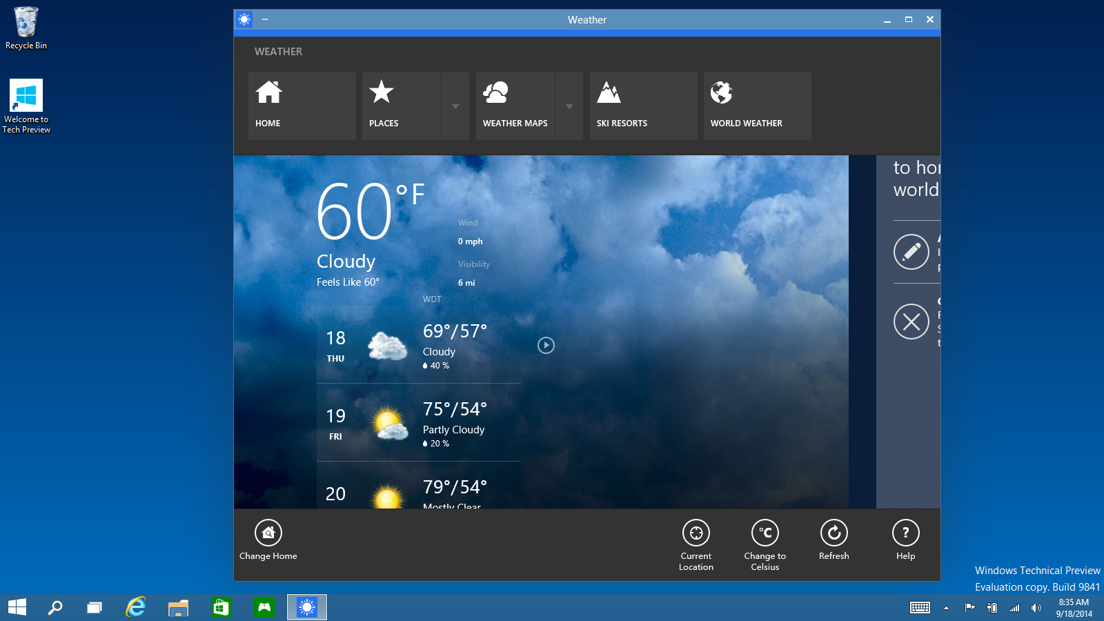
Windows 10 Universal Apps are only the beginning
 From a user’s perspective, smartphone apps on iOS, Android and Windows Phone are usually consistent in look, feel and user experience, but never as consistent with their desktop counterpart when it comes to functionality. This is fairly obvious as we, the users, have come to accept it as a reality of current devices. Yet... do we really have to? By the look of Windows 10’s Universal Apps, Microsoft says we don’t.
No: Universal Apps are not going to dumb down our desktop experience
We heard this before, to exhaustion, from articles across the web, of how Windows 10 Universal Apps will pose restrictions to how complex desktop apps will be. There is no more value to such notion, beyond being a brief conversation starter.
The immediate impression from a number of sources has been that universal apps, being designed to run across multiple devices running Windows 10, cannot be overly complex when accessed on the desktop. The fact is: the best software apps are the simplest to use, with a minimal and accessible interface.
Office application suites are the best example: no matter which platform we pick, Microsoft Office 360, Apple iWork, or Google Drive apps, they all present us with a uniformed and minimalist experience, that makes the old days of having to take classes to learn how to create a Word document, seem to belong in a past century. Nowadays apps are not studied. They are used.
What about high-end apps like Photoshop?
Let’s face it: it’s time for the most advanced and complex apps on the market to lose a couple of pounds, and push performance, over “tips and tricks”, and honestly, most of these tricks are not exactly intuitive. Well... because they are tricks.
The fundamental difference between desktop and mobile apps is the ability to use desktop shortcuts. While one could think that performance issues are what kept developers from even bothering to port advanced apps onto the mobile world, let’s face it: the focus on a keyboard-centric user experience has played a big part into keeping developers in a comfort zone.
To that Microsoft is saying: enough with the tricks. Time to get to work..
Photoshop Touch is the classic example of a clear attempt to port a high-end application experience to tablets and phones. It supports layers, photo enhancement, text input, and many other features we find in the endless beads-curtain of pull down menus hanging over our heads from the top of our full-size laptops and desktops.
It’s all about input
There are many ways to simplify an app, and it all comes down to the way we input commands, which is why Microsoft is integrating Cortana into Windows 10. This is not a gimmick: it’s clearly a testing ground to see real data in action, and determine whether users are ready for simpler apps that can be controlled without menus or keyboard shortcuts.
This is the future we have watched happen since Apple and Google gave a voice to devices and web search, to cut through the clutter and give us a multidimensional, and most importantly, intuitive, user experience.
Both Apple and Microsoft, as well as Google, have converged in multiple occasions on the topic of a future of apps that don’t even need a visual interface, and that is already happening, with the Internet of Things, in many devices we use in our daily lives.
“Especially in technology, we need revolutionary change, not incremental change.”
With this quote, Google’s own Larry Page makes the perfect case for Microsoft. It took a lot of planning and courage to turn the Windows experience inside out. With Windows 10, Microsoft is creating a disruptive trend: and it’s about time it did. The trend of Universal Apps is not something that needs to be pitched to consumers, because they will be using these apps every day and decide for themselves.
The ripples created from this trend is likely to eventually affect how other tech giants will offer their products, and given enough time, a landscape of device-agnostic options and solutions will suddenly become commonplace.