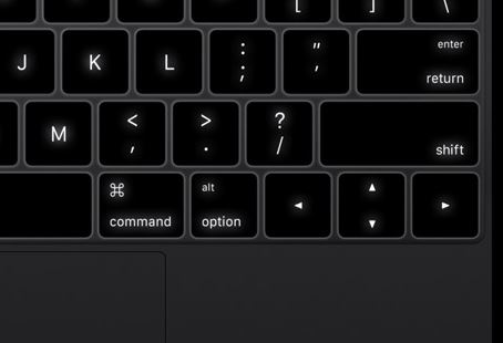
How Apple reinvented the keyboard for the new 12" MacBook
Among some of the extraordinary features in the new MacBook, its keyboard seems to be one which benefited from the least amount of attention, at least compared to the new device’s Force Touch trackpad.

Yet, an up-close look into the new MacBook’s keyboard will reveal more than just a creative use of space and layout. Thanks to its new design, and reengineering, this new keyboard construction has been a crucial factor in Apple’s ability to keep the entire thickness of the machine, down to 0.52 inches, at its tallest.
Butterfly trumps Scissors
The most common construction found in laptop keyboards involves what it known as “Scissors” architecture, which involves two components embedded into one another, in a scissors-like fashion, similar to the typical construction of a folding chair.
While the scissors architecture has proven viable in most laptop configurations in which thinness is not a crucial factor, flattening a keyboard designed with such architecture can only work to a certain point, before resulting in frequent failures in registering keystrokes.
In light of this issue, Apple came up with its own proprietary design: the Butterfly architecture. This new design changes the mechanical components beneath the keys, from a scissors-like construction, to a V-shaped design, or “butterfly”, which forces the key to move vertically, without tilting to the sides, as it concentrates the force of the keystroke to the center of the sensor circuit. This system results into an increased keystroke accuracy that fits perfectly into the new MacBook’s ultra-thin design.
Re-thinking back-lit keys
Back-lit keyboards have always presented problems for laptop manufacturers, as most designs involve the back illumination of the entire keyboard, through an LED diffuser based on optic fiber.
The problem associated with this design is that the diffusion of light to each key is not consistent, and it filters through the edges of each key, instead of illuminating only the symbols in the center.
Apple has solved this issue by doing away with diffusers altogether. Each key is fitted underneath with individual energy-efficient LEDs, that provide consistent illumination. This allows each key to be visible from every angle.
A bit of Apple Watch into the mix
Since 1999, Apple has used the same VAG Rounded font on all its keyboards. VAG Rounded was first designed by GGK Dusseldorf for car manufacturer Volkswagen, in the late 1970s. Apple’s decision to replace VAG Rounded, was most likely motivated by licensing issues, as the font now belongs to Adobe. San Francisco, an Apple proprietary font, designed for the Apple Watch, was chosen as a replacement for VAG Rounded.
The 2015 MacBook will begin shipping April 10, and will feature the revolutionary new USB Type-C connector, as well as Retina display and Force Touch trackpad.